PixBox is a tech company that generates animated digital human doubles from just a couple of photos in seconds, powering everything from virtual assistance to customer service avatars. When they came to me, their visual presence was entirely unbranded: inconsistent typography, no recognizable logo, clashing colors, and pitch materials that looked amateur rather than cutting-edge. I built a complete brand system from the ground up, designed to signal technical sophistication, creative possibility, and innovation simultaneously.
Challenge
PixBox's technology was remarkable, but their visual identity undermined credibility with investors and enterprise clients. Their existing pitch decks failed to communicate the product's potential, and the lack of any cohesive brand system made every touchpoint feel like a first draft. They needed to look like the tech-native company they were, not a side project, but a venture-ready platform.
Results
The rebrand transformed PixBox's investor conversations. Where previously they struggled to be taken seriously, the new pitch system and cohesive visual identity allowed their technology to command attention. The brand now communicated what the product did: turning something ordinary (a photo) into something extraordinary (a living digital presence), with design that feels equally magical and methodical.

Approach
I designed a brand that captures the paradox at PixBox's core: technology creating humanity. The visual language balances precision with personality.
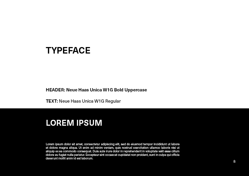
Typography: I selected a geometric sans-serif: clean, engineered, and forward-looking.
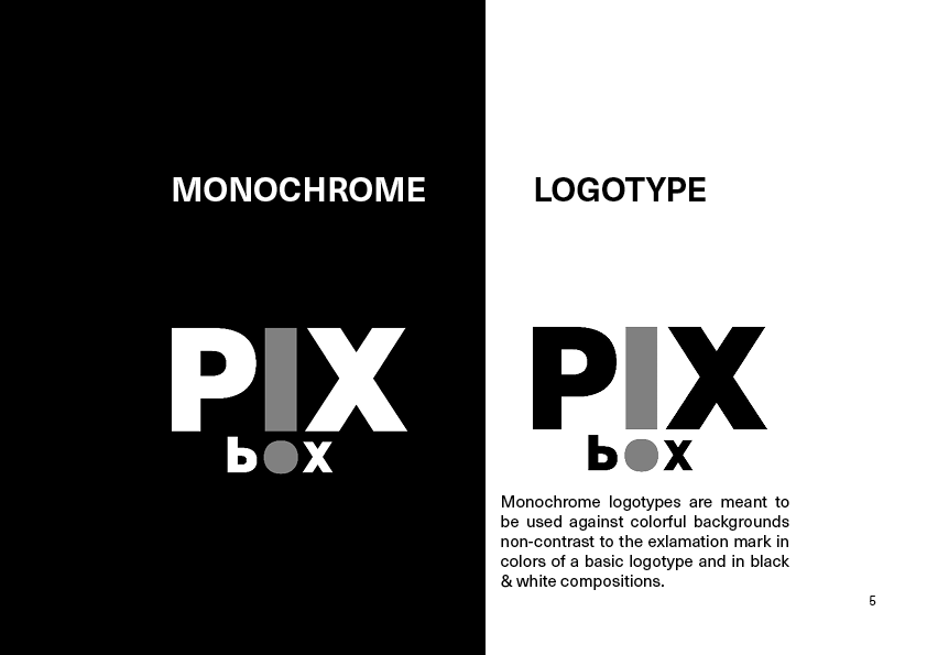
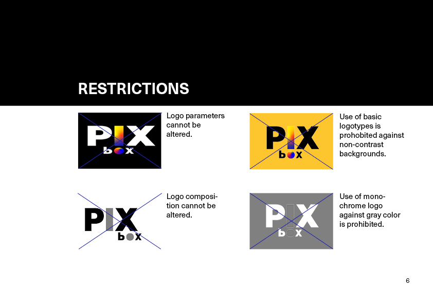
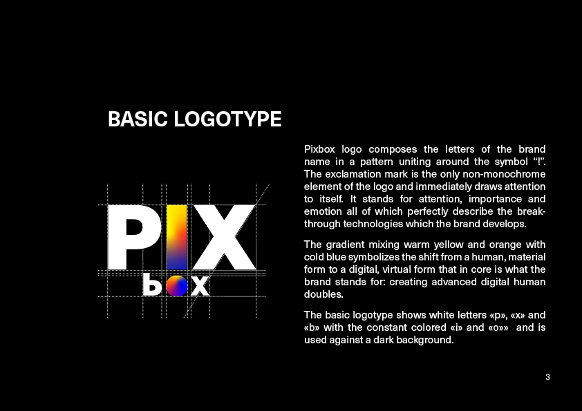
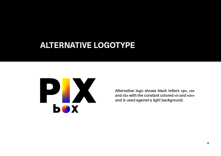
Logo: A play on the letter shapes, the logotype creates an exclamation mark - commanding attention, communicating novelty and progress. The invisible horizontal line between rectangle and circle serves as a mirroring horizon - a metaphor for the image-to-double technology. The gradient mixes warm with cold colors - humanity and technology.
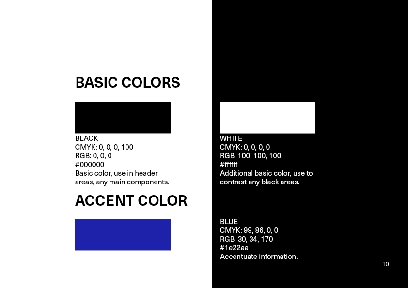
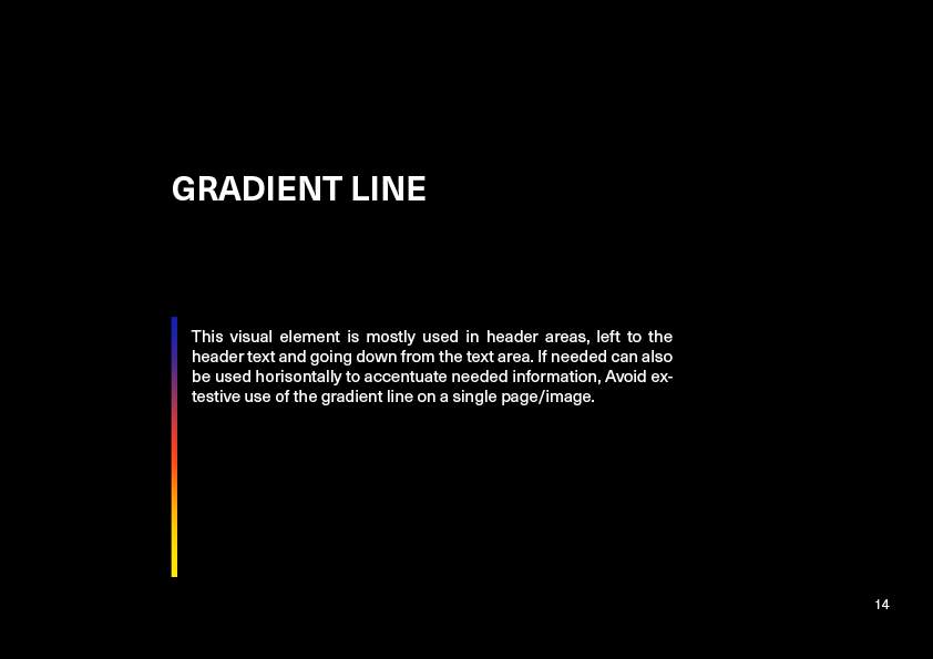
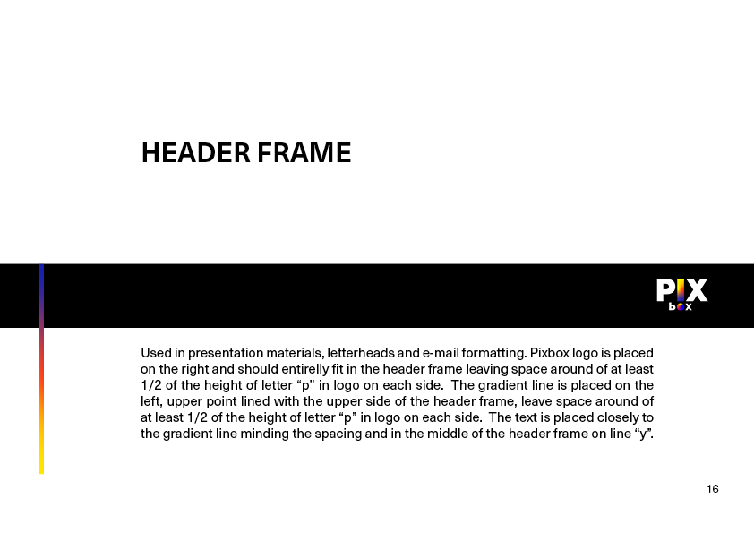
Color system: A deep, near-black base suggests technical depth and screen-native environments. Accents shift between electric blue (tech, energy, innovation) and soft sunny glow (skin, warmth, humanity). The interplay creates tension and resolution: technology meeting touch.
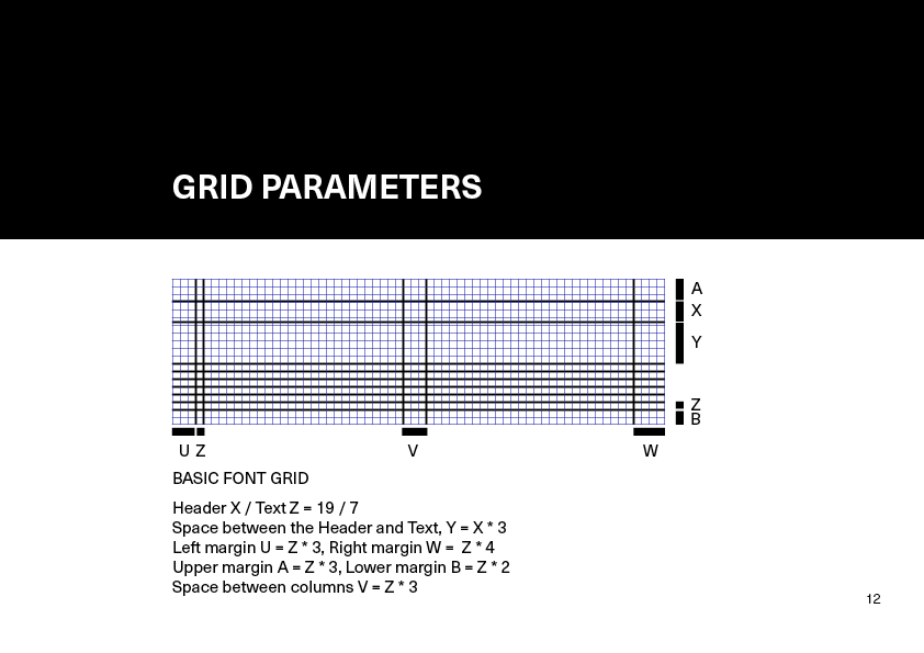
Presentation layout: I built a pitch deck system with generous negative space to let the content breathe and allow gravitational viewpoints where needed, minimalistic use of color and a rigid typography communicating reliability and long-term success.
Deliverables
Brand identity system: Logo, typography pairing, color palette, and usage guidelines
Pitch deck templates: Investor-facing presentation system with modular layouts
Basic presentation library: Standardized Google Slides / PowerPoint templates for team use